The Challenge
Sepro Mineral Systems is the largest supplier of mineral processing equipment in Canada.
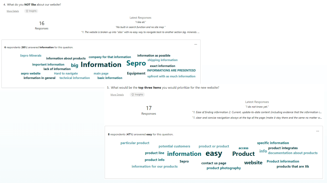
With a complex digital presence spread across six connected websites, Sepro needed to streamline its online footprint to improve user experience and centralize its product offerings.
The Sepro marketing team brought me in to help consolidate these websites while maintaining clarity for their global audience.
Solution
The broad network spanning six connected websites would be consolidated into two streamlined platforms.
The primary website, www.seprosystems.com, became a one-stop shop for all mineral processing, aggregates, and mixing and pumping offerings from the Sepro product family. The secondary website, labs.seprosystems.com, was created to highlight Sepro Labs' testing services and expertise.
Process
To ensure a seamless consolidation and design, the project followed a detailed process:
- Internal and customer surveys
- Stakeholder interviews
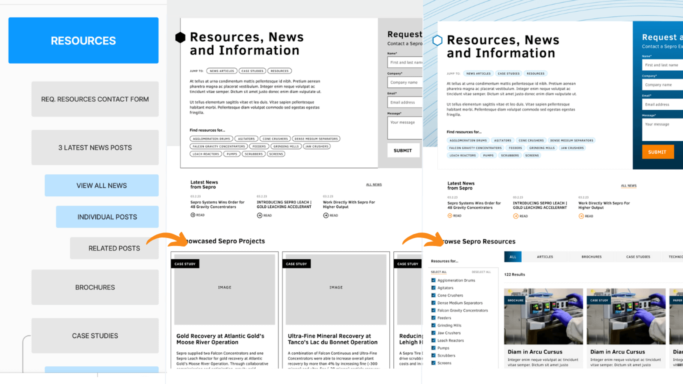
- Information Architecture Design
- Marketing collateral and assets repository creation
- Wire-framing and low-fidelity prototyping
- High-fidelity mock-ups and prototyping
- Content collection document design
- Custom WordPress theme and plugin development
- Internal QA testing
- Post-launch stakeholder feedback surveys
- Ongoing improvements through post-launch agile development

Website Redesign & Key Features
The previous Sepro network of websites emphasized branding with navigation points like ‘knowledge’, ‘experience’, and ‘innovation.’
While effective for introducing new users to the company, this made it harder for existing customers to quickly access product information and resources.
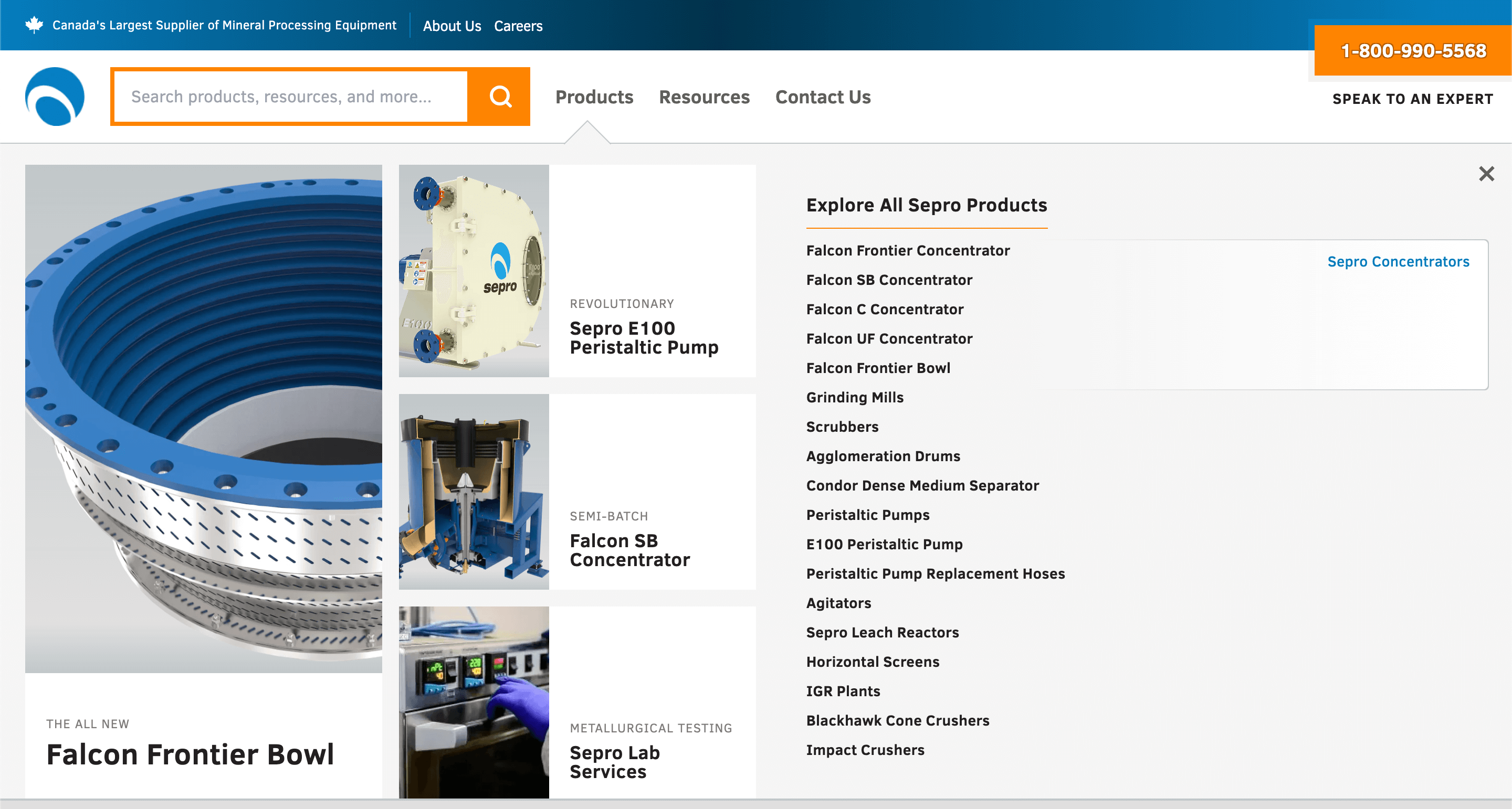
Taking inspiration from leading eCommerce giants, the new website’s navigation places search front and center, enabling customers to quickly find what they need.
Search results are filterable by content type, including Articles, Brochures, Case Studies, Products, Technical Papers, and Videos.
Mega-menu Navigation
The ‘Products’ link in the primary navigation expands to reveal a mega-menu highlighting Sepro’s premier offerings.

Modular Product Pages
Built with WordPress Gutenberg Blocks, product pages offer flexibility for the marketing team to customize layouts.
Product Page Features
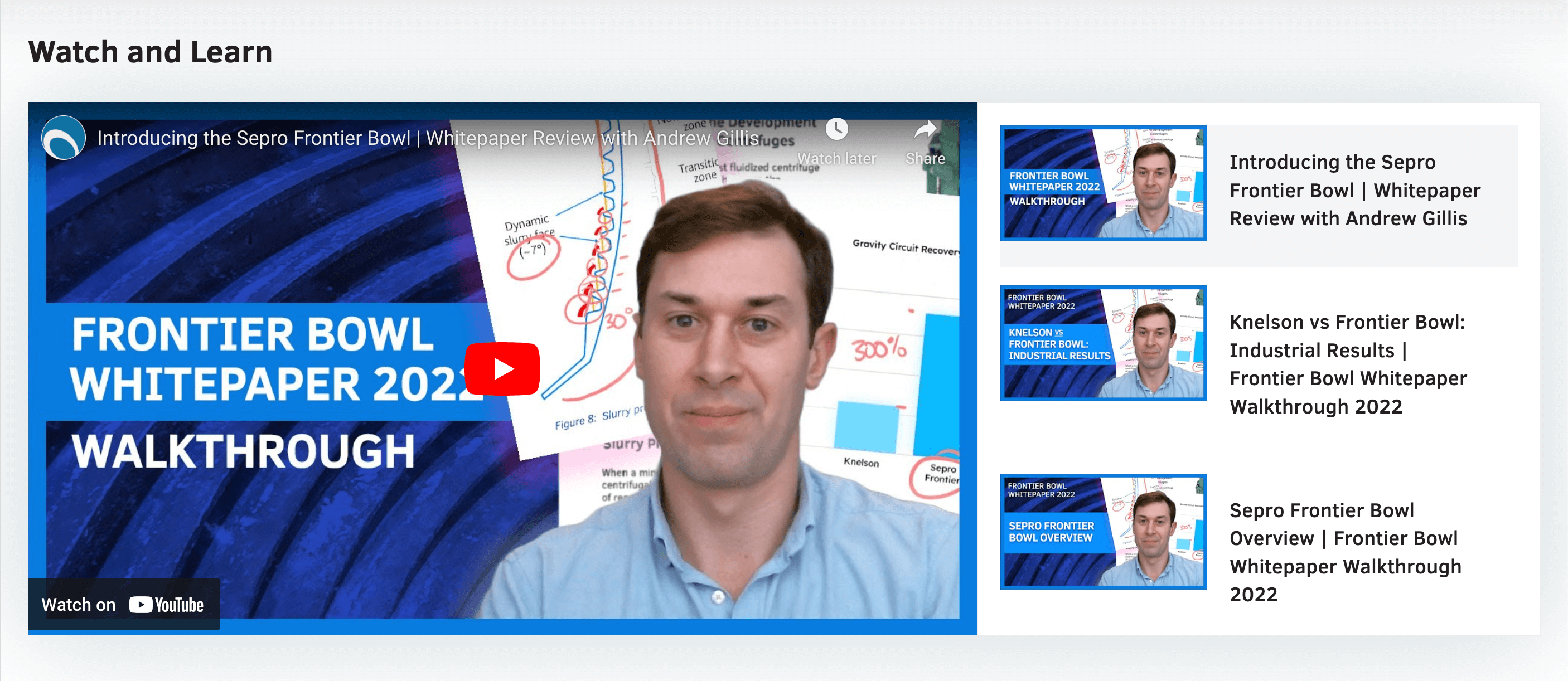
Key elements include jump-to links for detailed content, video browsers, downloadable resources, and compact contact forms synced with their CRM.
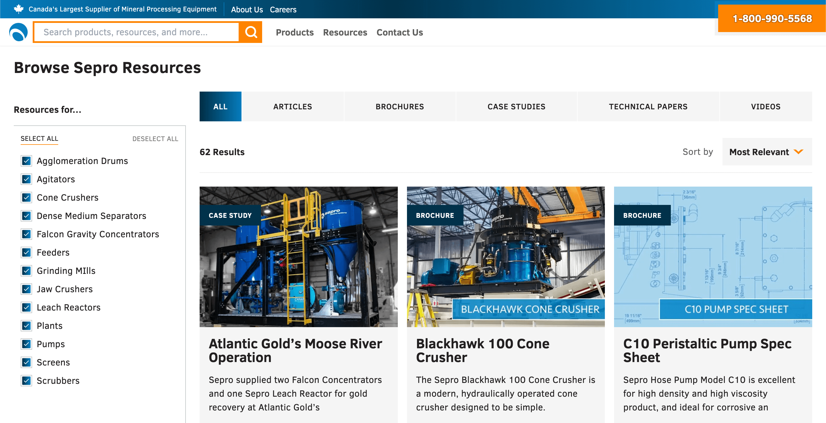
Interactive Resource Browser
To improve accessibility to Sepro’s resources, we created a custom interactive Resources Browser. With asynchronous filters and sorting, users can quickly discover documents related to Sepro’s product categories without reloading pages.
Custom Post Types were created for Articles, Brochures, Case Studies, Technical Papers, and Videos, each with custom taxonomies to enhance discoverability across the site.
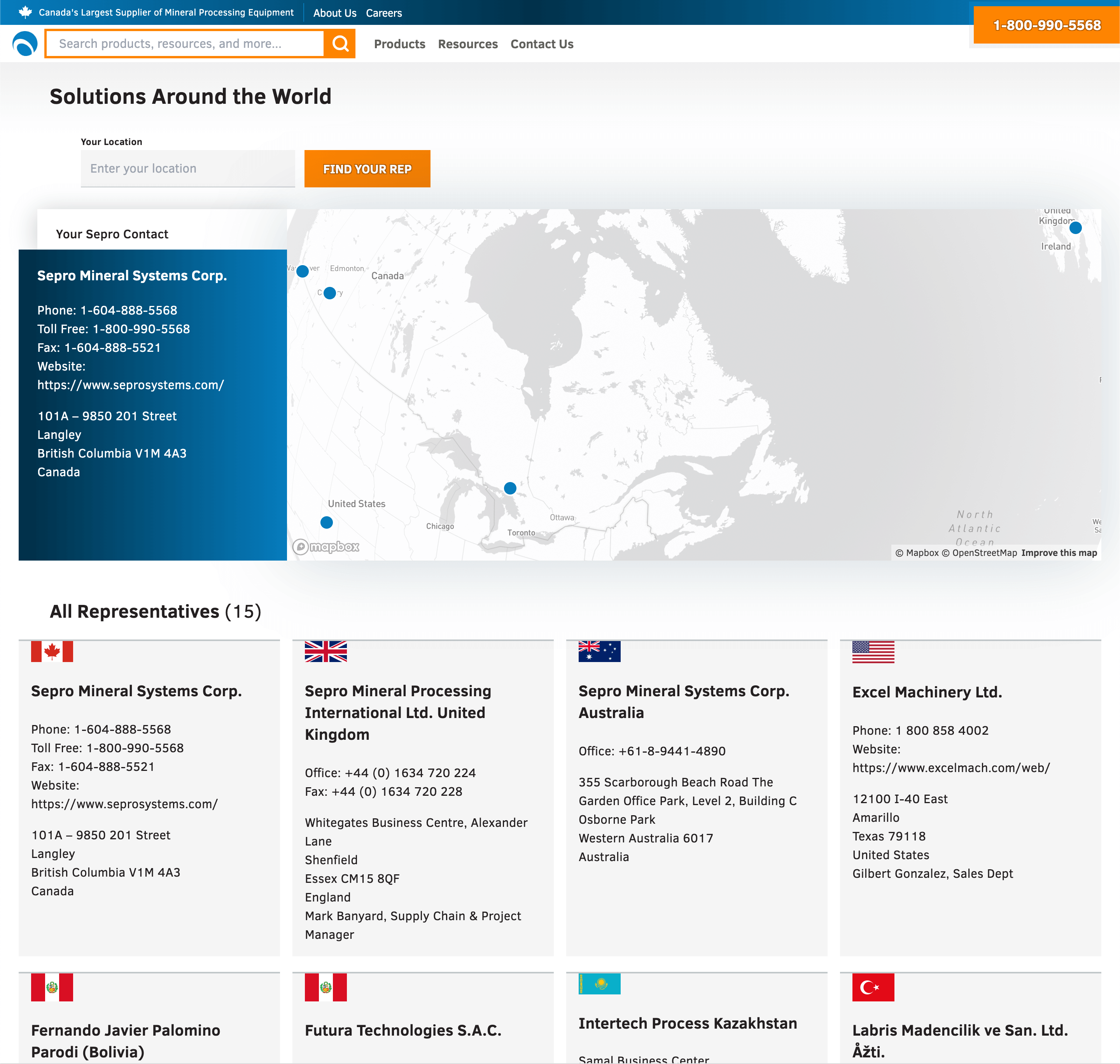
Global Representative Finder
To help customers find the right point of contact, we built an interactive map using Mapbox, which automatically detects the user’s location and highlights their nearest Sepro representative.
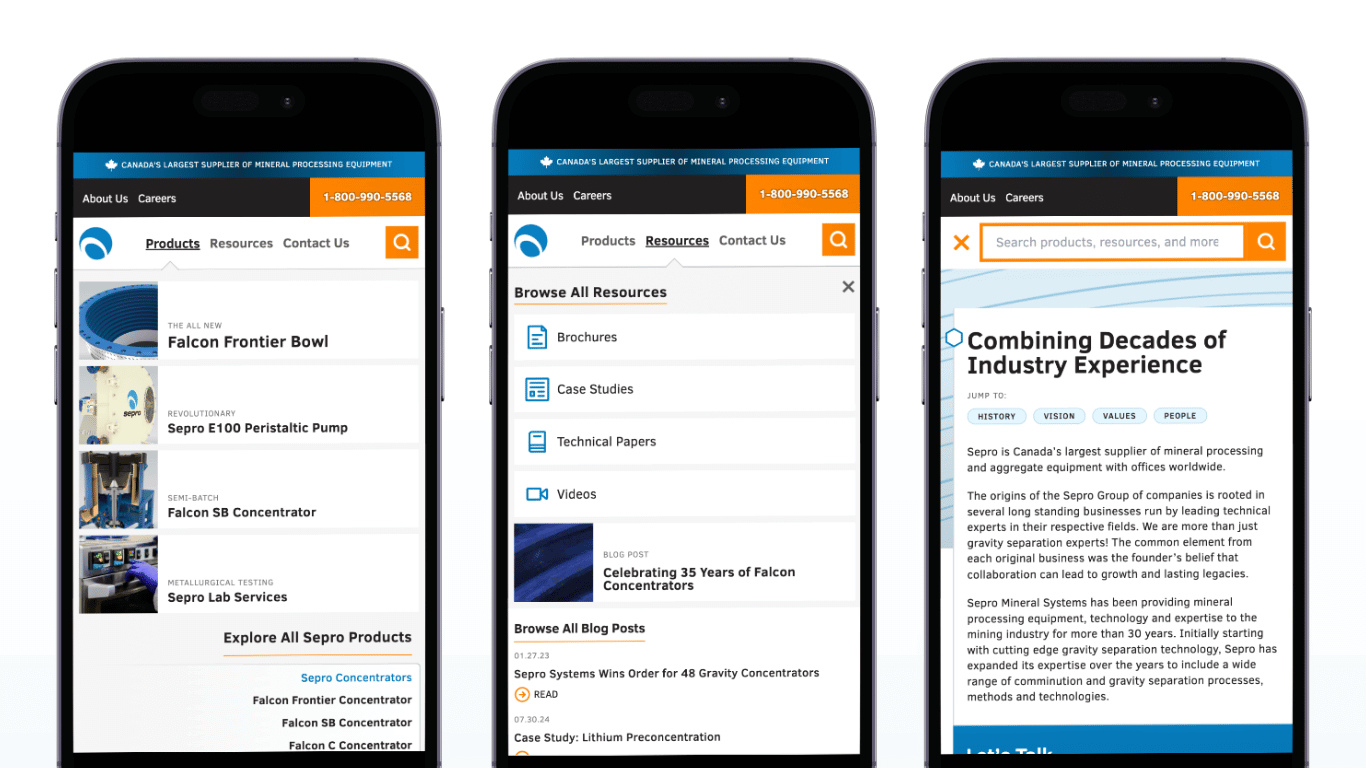
Mobile-First Design
Despite complex navigation needs, the site is fully mobile-friendly. The desktop navigation seamlessly translates to mobile without the need for hamburger menus or a deprioritization of important elements.
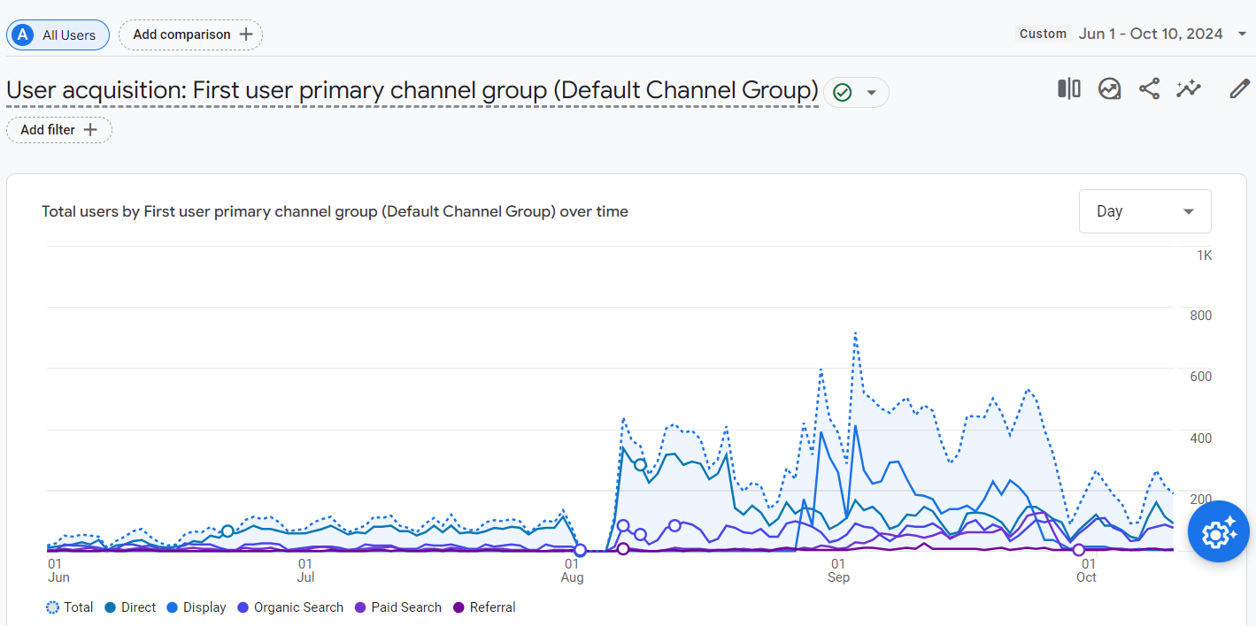
The Results
By consolidating Sepro's websites into two modular platforms, we were able to create a more efficient, user-friendly experience. The new structure allows users to find relevant product and resource information more easily while empowering Sepro’s marketing team to build customized landing pages on the fly without third-party tools.
“Matthew is dependable, responsive, and easy to work with. Above all, he delivers a quality product that goes above and beyond expectations. Matthew will go out of his way to understand your users’ pain points and provide a solution that looks great while helping to drive business results.”— Christopher Lam, Marketing Strategist, Sepro Systems
Mobile-first and completely responsive.
Developed for phones without compromise, and expand elegantly for larger screen sizes.
Easy to edit using WordPress
Tailor-made WordPress Gutenberg blocks empower Sepro's marketing team.
Custom-built for performance and flexibility.
The custom WordPress theme and plugins streamline communication for Sepro's vast offerings

